Page 3 of 3

Posted: September 29th, 2011, 10:04 am
by shando
happywaffle wrote: I nominate "Chris RB Fay" for the Hideout girl's name.

And then I cry at how few of you get the joke.
I get it!

Posted: September 29th, 2011, 11:22 am
by HerrHerr
shando wrote:
happywaffle wrote: I nominate "Chris RB Fay" for the Hideout girl's name.

And then I cry at how few of you get the joke.
I get it!
E-LIM-I-NATE!

Posted: September 29th, 2011, 11:40 am
by Brad Hawkins
The ViewMaster in the Institution's logo is called Binoculus, Overlord of the Third Dimension.

Posted: September 29th, 2011, 11:42 am
by Pdyx

Posted: September 29th, 2011, 2:22 pm
by Jastroch
B. Tribe wrote:
Chuy! wrote:
happywaffle wrote:Hideout Girl is naked! Was worth starting this thread just for that gem of knowledge.

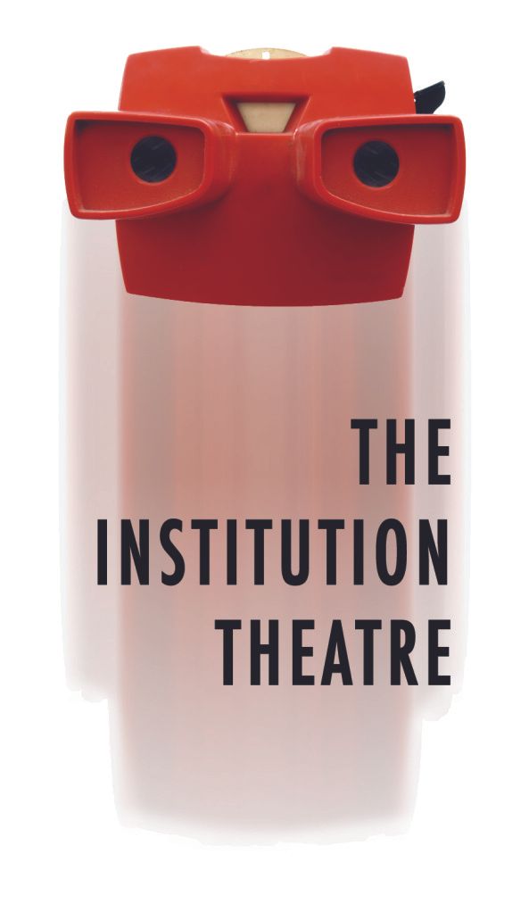
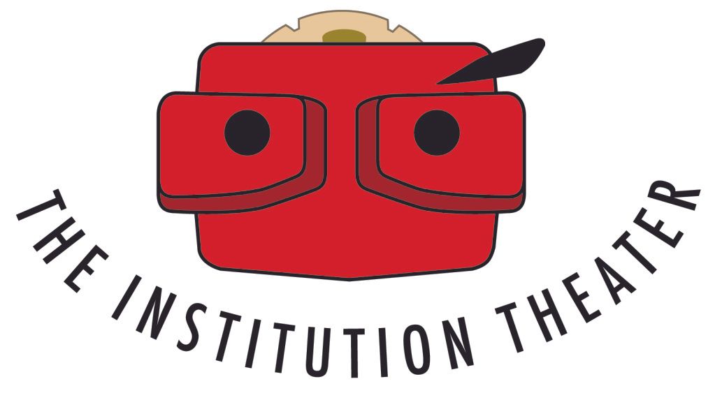
How about Salvage Vanguard? Institution? New Movement?
Yes. All are naked...
One of my castmates in Mainstage keeps saying that the two boxers in the CT logo look less like they're fighting and more like one dude is pulling down the other guys pants IN PREPARATION FOR ORAL SEX.

Looks more like a punch in the gut to me. A punch in the gut IN PREPARATION FOR ORAL SEX.
Fun fact: after we painted them on the side of the building, I realized that very same thing. I said "If someone doesn't graffiti a dick on this thing in the first year that we're open, I'll have to do it myself." I didn't have the balls.

Posted: September 29th, 2011, 2:25 pm
by Jastroch
re: the choice of burgundy for a color, because no one asked.

I had to teach myself design by copying other, more talented, people. I rarely had the opportunity to design in color in college. The only colors I knew that looked cool together were burgundy and yellowish. They became the ColdTowne color scheme cause I didn't know what else looked good.

Alsk, my car is that color

Posted: November 30th, 2011, 10:40 am
by hypersuit
I made the Gnap! logo (as I have almost everything design-wise at Gnap! like the show logos and most of the posters). I'm not sure what the long story about the bombs Shannon is talking about is besides some random graphic design influences in my life that I'm pretty sure I never told him about.

I was obsessed Cold-War-era Soviet propaganda posters at the time which include a lot of armory imagery.
Image

Then I was in an airport and there was a warning about what you couldn't take on the plane, represented in images, and one was an old-school cartoon villain style bomb and I just thought that was hilarious, that someone would be walking onto the plane with a huge round bomb, fuse burning.
Image

It seemed to fit with the already cartoony origins of the company identity.

I got the explosion from Hong Kong Phooey:
Image

These are the options I had for Shannon in May 2006:
Image

Shannon picked one and that was it:
Image

These were some ideas I had before I got bomb happy:
Image

Posted: November 30th, 2011, 10:57 am
by happywaffle
That's awesome, thanks for the history. I actually never noticed that was a bomb before (the fuse is juuuust barely visible in the border of the explosion). Still a great logo.

Posted: November 30th, 2011, 11:11 am
by shando
hypersuit wrote:I made the Gnap! logo (as I have almost everything design-wise at Gnap! like the show logos and most of the posters). I'm not sure what the long story about the bombs Shannon is talking about is besides some random graphic design influences in my life that I'm pretty sure I never told him about.

I was obsessed Cold-War-era Soviet propaganda posters at the time which include a lot of armory imagery.
Image

Then I was in an airport and there was a warning about what you couldn't take on the plane, represented in images, and one was an old-school cartoon villain style bomb and I just thought that was hilarious, that someone would be walking onto the plane with a huge round bomb, fuse burning.
Image

It seemed to fit with the already cartoony origins of the company identity.

I got the explosion from Hong Kong Phooey:
Image

These are the options I had for Shannon in May 2006:
Image

Shannon picked one and that was it:
Image

These were some ideas I had before I got bomb happy:
Image
All of this was the longer story about the logo I was talking about. Even I didn't know about some of this until just now! (Hong Kong Phooey!!)

Posted: November 30th, 2011, 11:17 am
by hypersuit
happywaffle wrote:That's awesome, thanks for the history. I actually never noticed that was a bomb before (the fuse is juuuust barely visible in the border of the explosion). Still a great logo.
This was a very conscious decision. As are most of the design decisions I make. I don't just slap this shit together.

Posted: November 30th, 2011, 11:43 am
by Roy Janik
hypersuit wrote:
happywaffle wrote:That's awesome, thanks for the history. I actually never noticed that was a bomb before (the fuse is juuuust barely visible in the border of the explosion). Still a great logo.
This was a very conscious decision. As are most of the design decisions I make. I don't just slap this shit together.
And now that I see the bomb, I can't unsee it.

Awesome job!

Posted: November 30th, 2011, 12:30 pm
by Steeeph
This was so fun to read! Thanks to everyone for taking the time to write out your stories. I love the Smurf episode. Gnap! Gnap!

Do we know more about The Institution logo?

Posted: November 30th, 2011, 1:02 pm
by Asaf
I keep meaning to get Tom to write on this thread about The Institution Theater, but he's been so busy lately.

This is what I understand:
When Tom first moved here, he connected with Esther's Follies through friends and started his improv school there. He thought Esther's was an institution, like Second City so that is why he named it that.

Tom has always been a fan of retro kitsch and he used a photo of a viewmaster to symbolize the theater.

This was made with the help of Zach Ward:
Image

I made a version of illustrator to get us to a more safe distance from copyright infringement, to make it more malleable to whatever graphics needs we have and, most importantly, to play up how it looks like Tom with glasses on (another reason he picked it as a logo).

The text was added in an obvious smile shape to complete the anthropomorphism.

Image

Posted: November 30th, 2011, 1:54 pm
by Rev. Jordan T. Maxwell
shando wrote:
hypersuit wrote:I got the explosion from Hong Kong Phooey:
Image
(Hong Kong Phooey!!)
number one super guy!