Virtual Flyer Roundtable
Anything about the AIC itself.
Moderators: arclight, happywaffle

Virtual Flyer Roundtable
Post flyers to this thread as you make them. Now and forever. I'll start.

and the generic version...

PGraph plays every Thursday at 8pm! https://www.hideouttheatre.com/shows/pgraph/
I love the primary image you chose for this one. Here is a list of my feedback...Roy Janik wrote:
1. The left side of the flyer is cluttered and hard to read at a glance. I would suggest trying all of the yellow text left justified directly under the logo. I would also try doing the logo stacked but each line on a level horizontal plane. I think skewing it makes it harder to read.
2. If you were to do what I suggested above, I think it would make the two stars with the troupe photos in it stand out more since they would be the only thing skewed on the page. Also, leave a bit of negative space between your tagline text and the star photos.
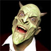
3. In your photo there is a hat in the background behind the cowboy's head. If you were to photoshop that out and make it black/dark brown solid background, your primary image would pop more.
Overall, great concept. I like that you boiled it down to the essentials. Now just play around with the placement of those essentials and you'll be golden.
"Have you ever scrapped high?" Jon Bolden "Stabby" - After School Improv
http://www.improvforevil.com
http://www.improvforevil.com
-
- kbadr Offline
- Posts: 3614
- Joined: August 23rd, 2005, 9:00 am
- Location: Austin, TX (Kareem Badr)
- Contact:
-

- improvstitute Offline
- Posts: 790
- Joined: May 16th, 2006, 12:14 am

-

- bradisntclever Offline
- Site Admin
- Posts: 1747
- Joined: February 27th, 2007, 1:25 am
- Location: Brooklyn, NY
This is solid advice. I agree with everything.vine311 wrote:I love the primary image you chose for this one. Here is a list of my feedback...Roy Janik wrote:
1. The left side of the flyer is cluttered and hard to read at a glance. I would suggest trying all of the yellow text left justified directly under the logo. I would also try doing the logo stacked but each line on a level horizontal plane. I think skewing it makes it harder to read.
2. If you were to do what I suggested above, I think it would make the two stars with the troupe photos in it stand out more since they would be the only thing skewed on the page. Also, leave a bit of negative space between your tagline text and the star photos.
3. In your photo there is a hat in the background behind the cowboy's head. If you were to photoshop that out and make it black/dark brown solid background, your primary image would pop more.
Overall, great concept. I like that you boiled it down to the essentials. Now just play around with the placement of those essentials and you'll be golden.
-
- improvstitute Offline
- Posts: 790
- Joined: May 16th, 2006, 12:14 am
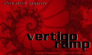
I think you need a bit more contrast on the page. Maybe you should try the logo text in either white or pale yellow and use a hard-edged, black, drop shadow behind it.improvstitute wrote:One for Vertigo Ramp:
This one is a bit more difficult to see at a lower resolution
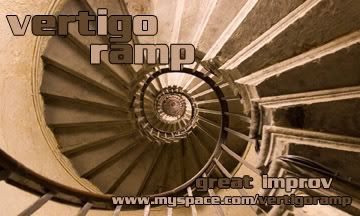
What is the impression you want people to walk away with after having seen this poster/handed this flyer? The image you've chosen here isn't as strong as the one you used in the junk flyer. I like the banner I just saw on these boards that use the spiral staircase better.
Also, be careful of putting black text on a red background. If the contrast isn't high enough, our colorblind friends can't read it. It all looks like the same shade of grey to them. I have to be careful with this kind of stuff all the time in the web design world so that all of my sites are accessible. I think the same rule should apply to printed materials though.
"Have you ever scrapped high?" Jon Bolden "Stabby" - After School Improv
http://www.improvforevil.com
http://www.improvforevil.com
-
- improvstitute Offline
- Posts: 790
- Joined: May 16th, 2006, 12:14 am
-
- improvstitute Offline
- Posts: 790
- Joined: May 16th, 2006, 12:14 am
I dig the layout but the darker color in the letters still doesn't have enough contrast against the background. Try lightening it 25 - 50% that way it will still be darker than the lighter letters next to it but it stand out from the background more.improvstitute wrote:Like this...vine311 wrote:I like the banner I just saw on these boards that use the spiral staircase better.
"Have you ever scrapped high?" Jon Bolden "Stabby" - After School Improv
http://www.improvforevil.com
http://www.improvforevil.com


Here's mach 2. I tried to black out the hat area entirely, but it made the border too blocky.
I kinda liked the hat though.
PGraph plays every Thursday at 8pm! https://www.hideouttheatre.com/shows/pgraph/